WEIGHT
SPACE
RHYTHM
WEIGHT
SPACE
RHYTHM
10 Days of Type
Digital Design in Motion
Kinetic Typography, Type Animation,
Graphic Design, Expressive Typography
A self-directed 10-day design challenge exploring kinetic typography, expressive letterforms, and the relationship between motion and meaning.
THE BRIEF
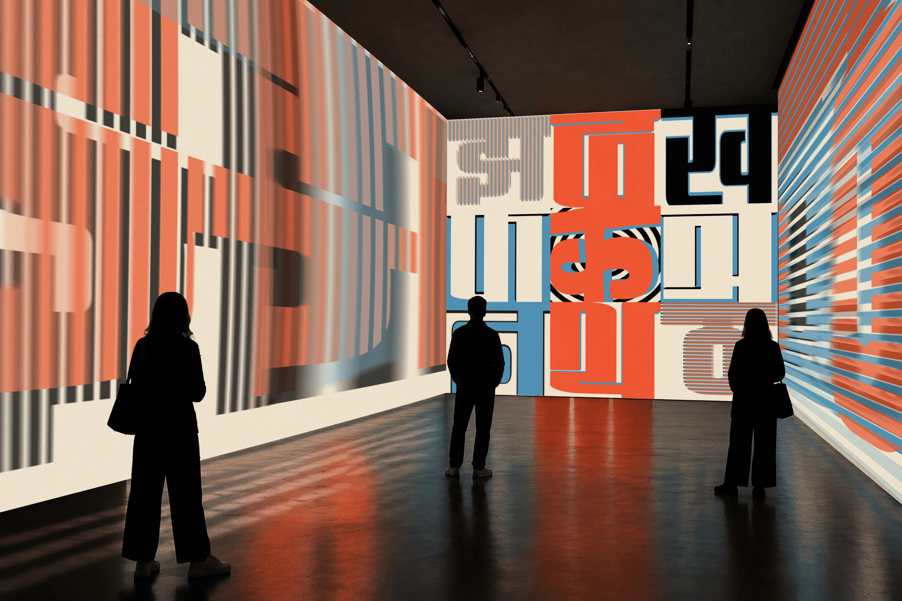
Typography is often experienced as a fixed form. 10 Days of Type explores how movement can change the way letterforms are seen and understood. I designed and animated nine Devanagari letters, using the Devanagari script as a visual reference. Each letter transforms through geometric forms, repetition, scale and rhythm.
The visual system brings together Bauhaus geometry and the bold character of 90s graphic design. Orange, blue, black and cream create a consistent palette across all nine animations, while each letter explores its own rhythm, movement and transformation.
90s RETRO MINIMALISM
The 90s influence brings bold graphics, limited color and playful geometry into the visual language. These elements are paired with Devanagari letterforms to explore how a traditional script can take on a contemporary expression through motion.
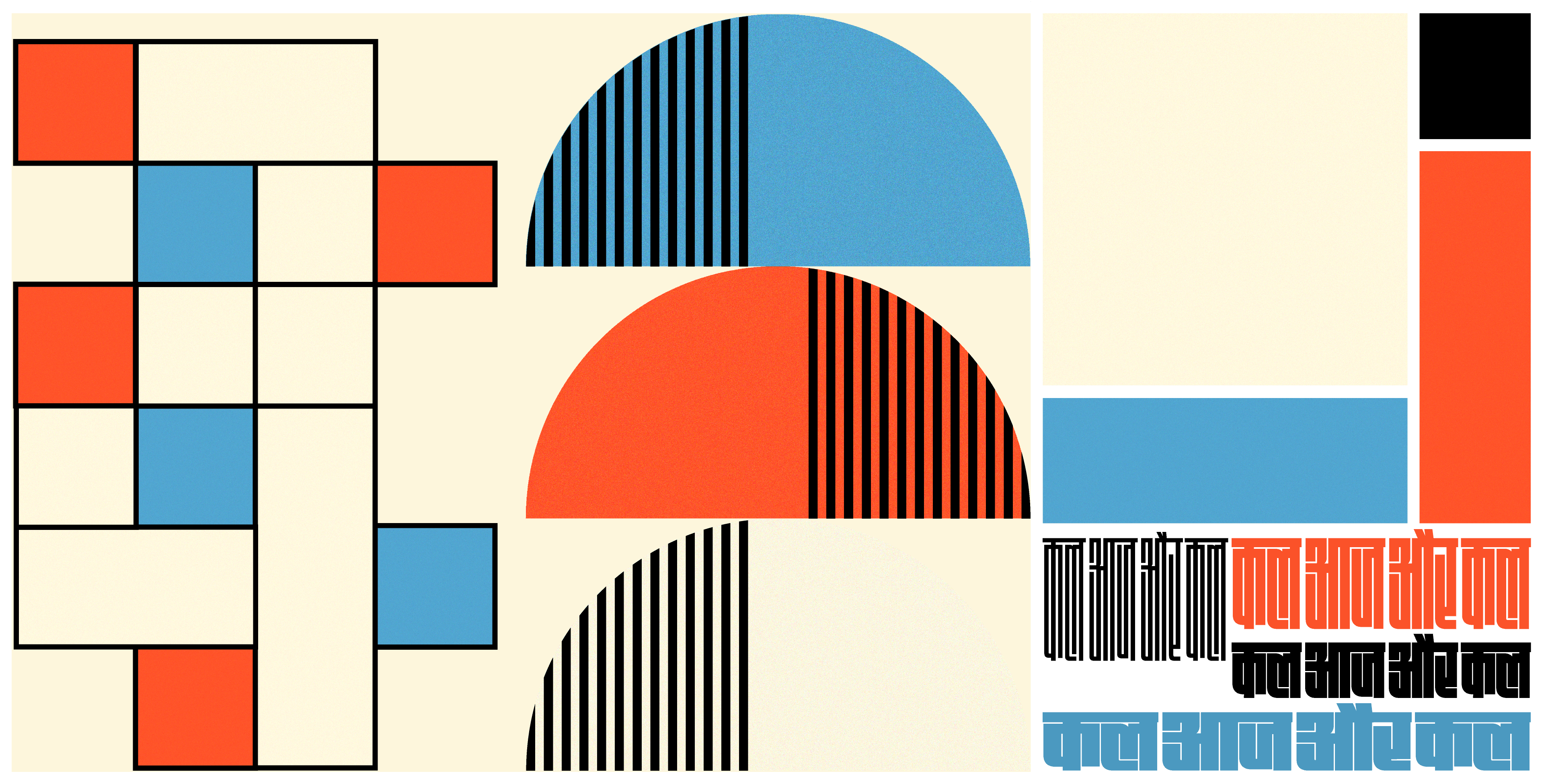
MINIMAL COLORS
A limited palette of bold, contrasting colors reflects the visual language of the 90s while keeping the compositions vibrant, balanced and consistent across each animation.
WEIGHT
SPACE
RHYTHM
FORM
CONTRAST
REVEAL
BALANCE
ECHO
OVERLAP
DESIGN DECISIONS
Color was intentionally restrained, with most animations using monochromatic or duotone palettes to keep attention on form and movement. Easing became part of the visual language, shaping how each letter enters, transforms and settles. Sound was intentionally excluded, allowing every animation to communicate through type, rhythm and motion alone.

PROJECT RECAP
10 Days of Type strengthened my ability to make clear visual decisions within a defined set of constraints. The project showed how motion can become part of a letterform’s expression rather than an added effect. Timing, speed, transitions and pauses shaped how each character appeared, transformed and disappeared, creating meaning beyond its static form.

Let’s Connect
Take Me Up
20∞ designed at midnight, perfected by dawn!