THE PROCESS
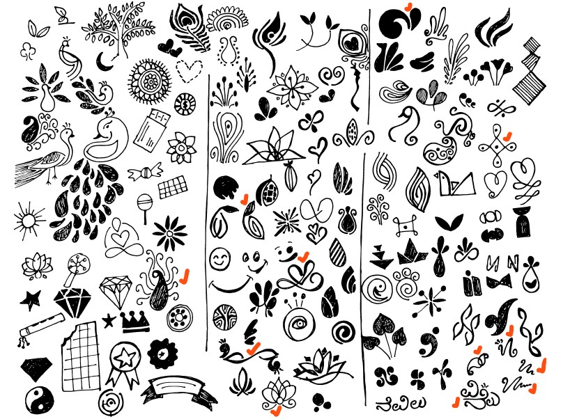
The identity started with words, sketches, and questions about what could make NAVILUNA feel distinctly Indian without relying
on familiar visual clichés. I studied peacock feathers, crest formations, Indian ornamental patterns, Kannada letterforms, and geometric structures. Early sketches explored these references broadly before I began reducing them into simpler forms.
Across three rounds of ideation, the mark moved from literal peacock references toward abstraction. Repeating and stacking the diamond shape eventually created the final symbol: a geometric interpretation of the peacock crest that could scale from a small logo to a repeating packaging motif. That same visual language became the foundation for the wider identity, connecting the logo, typography, color, chocolate packaging, and gift box into one system.



GIFT BOX
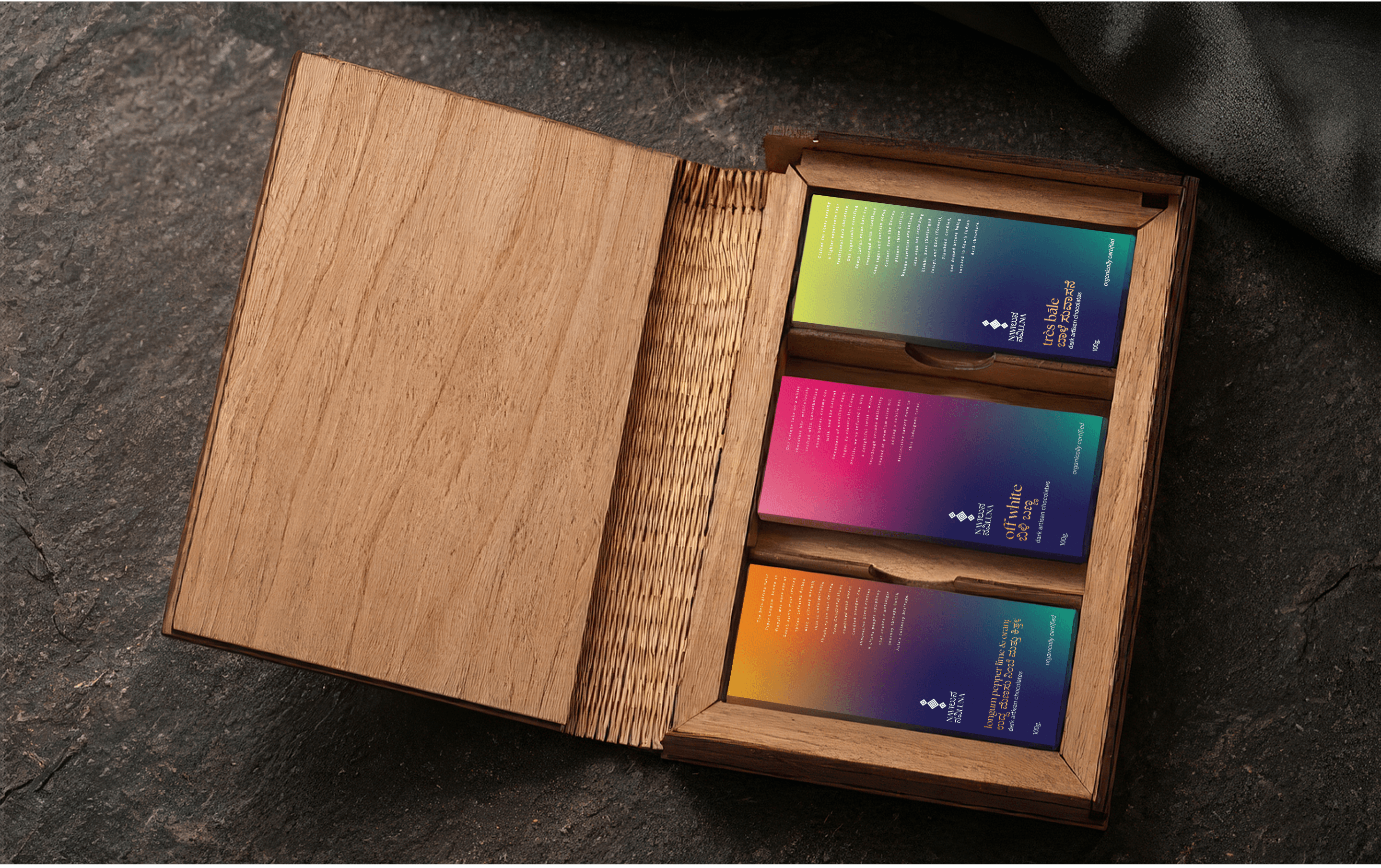
For the gift box, I wanted the packaging to remain useful after the chocolates were gone. I took inspiration from the familiar
form of a hardcover notebook. The box opens like a book to reveal a collection of NAVILUNA chocolate bars inside, turning the act of gifting into a small discovery. The cover carries the diamond motif across a deep, dark surface, paired with “Dark Artisan Chocolate”
in The Seasons. Rather than becoming disposable packaging, the box is designed to remain as a keepsake for storing notes, objects,
and memories.

BRAND APPLICATION
The NAVILUNA identity extends beyond packaging into social media, stationery, and small brand details. From the wax seal to
the postcard and bookmark, each application carries the same typography, color, and diamond motif to create a consistent rich and luxurious brand experience.




PACKAGING DESIGN
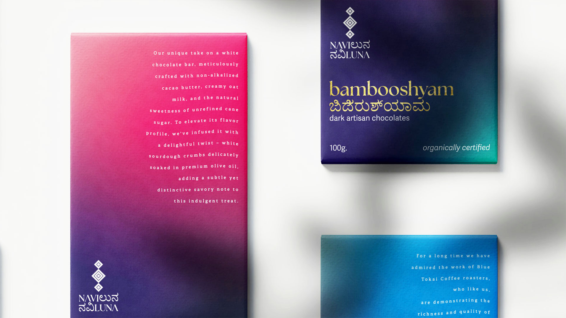
Designed the chocolate bars as 6.5 by 3 inch envelope style packages that turn opening a chocolate bar into part of the experience.
The front introduces the NAVILUNA identity, flavor, and cacao profile through bold typography and color. Once opened, the front panel can be removed and reused as a bookmark, giving part of the package a purpose beyond the chocolate itself.
Across the collection, changing gradients distinguish individual flavors while maintaining a consistent structure. The back organizes ingredients and essential product information, allowing the expressive front and functional back to work as one system. The packaging
is user-friendly with an easy-opening mechanism, mirroring the logo's palette. The gradient color scheme symbolizes the diverse flavors. The front side also serves as a bookmark.


TYPEFACE
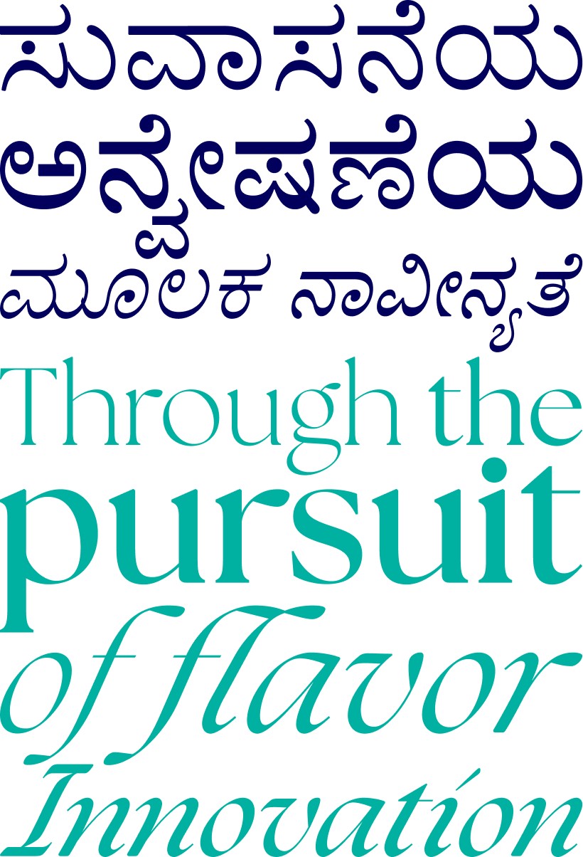
Typography extends the bilingual character of the identity. The Seasons leads the Latin typography with expressive curves and a refined editorial quality. Adobe Kannada introduces the Indic script through rounded letterforms that sit naturally alongside. Adelle Sans supports the system for product information and longer text, giving the packaging a clear and readable secondary typeface. Together, the three typefaces allow NAVILUNA to move between expressive brand moments and practical packaging information while keeping both scripts visually connected.


COLOR STORY
Navy Blue (#02005C) and Turquoise Blue (#00B0A1) form NAVILUNA’s primary color palette, drawing from the deep blue and green tones of peacock plumage. The two colors flow into a gradient across the identity, bringing depth and movement to the logo while connecting the visual system back to the peacock.


LOGO DESIGN
The identity begins with the peacock, a symbol closely tied to Indian art and culture. I abstracted the shape of its crest into a geometric diamond mark, then built a stacked form that could work across packaging and brand applications. A navy to turquoise color transition draws from the shifting colors of peacock plumage. The wordmark brings two scripts together. “NAVI” appears in Latin letters, while “luna” is written in Kannada. Together, they create a bilingual identity that connects the brand’s Indian roots with its contemporary character. In the local language, Naviluna translates to “the peacock.”


Naviluna
Brand Identity & Design Systems
Brand Identity, Packaging Design,
Brand Storytelling, Visual Design
Founded in 2012 as Earth Loaf, NAVILUNA is one of India’s early bean to bar chocolate makers to work exclusively with organically certified Indian cacao. Each bar celebrates cacao grown in India while drawing from the country’s landscapes, flavors, and culture.
As the brand evolved, its identity and packaging needed a stronger story to connect these values across the collection. I redesigned NAVILUNA as a contemporary Indian chocolate brand, building a visual identity and packaging system rooted in the peacock, regional language, and Indian ornamentation.
The project also became an exploration of how a brand can move from screen to shelf. I developed the work through digital rendering, physical model making, product photography, lighting, composition, image editing, and art direction.

Let’s Connect
Take Me Up
20∞ designed at midnight, perfected by dawn!