

Visual Design
Pixel Weave
- Role
- Visual Designer
- Year
- 2026
- Disciplines
- Visual Design, Interaction Design, Environmental Graphics, Identity Design
- Recognition
- Graphis New Talent, Silver 2025
Pixel Weave is an immersive installation, designed for museums, that translates Patan Patola, a centuries old double ikat weaving tradition from Gujarat, India, into a pixel pattern system. I studied the original Patola designs and rebuilt them as patterns on a grid system I designed. The result is a library of six patterns, from the basket to the nine jewel, each keeping its traditional Gujarati name.
Visitors learn the craft by making it: they build patterns on a screen, watch them appear at scale on cloth, and connect with the traditions behind each motif. At Imagine RIT, more than 350 visitors created and downloaded their own patterns. Rather than replacing the handmade, Pixel Weave invites curiosity about the people and precision behind every pattern.
The introduction
Patan Patola is a double ikat textile from Patan, Gujarat, protected by a Geographical Indication mark. Both the warp and weft threads are dyed before weaving, so every motif has to be planned thread by thread. There are around 30 original designs, all made with natural dyes, and a single piece takes 8 months to 1.5 years to weave. The Salvi family has kept this knowledge alive for generations.
What are you making?
Pixel Weave has four parts: a pixel grid system built on the logic of the weave, a library of six patterns that each keep their Gujarati name, an identity with a wordmark and pixel mark, and an interactive installation where a touchscreen and projected cloth turn visitors into weavers.
Why are you making?
Patola is part of my community’s heritage, and I grew up around it. Yet the craft is disappearing, and the meaning behind its motifs is becoming less familiar to a wider audience. I wanted people to understand that knowledge by using it, not just by looking at a finished textile.
How are you making?
I started with the original designs, breaking each motif down onto a 21 by 21 grid where every cell stands for one crossing of warp and weft. From there I built a five color palette and six patterns, from the basket to the nine jewel. The same grid then extends beyond the screen, into the identity, print, and a bookmark I hand screen printed in three layers.



Visual concept design 01
I began by testing an open canvas. In more than 20 user experiments, I gave participants a blank grid with unlimited pixels and colors, and asked them to create a motif that could repeat into a larger pattern.
The results were consistent. Most participants used only a small part of the grid, stayed with two or three colors, and placed pixels at random, so their work turned into abstract pictures rather than structured patterns.
Two learnings shaped the next stage. Without some knowledge of the tradition, people didn’t know where to begin. And an open canvas invited drawing, not weaving. The structure of the craft had to be built into the tool itself.

Why pixels?
Patola is built thread by thread, and every crossing of warp and weft fixes one point of color, which is exactly how a pixel works. Turning that crossing into a pixel let me rebuild each motif on a grid while keeping the logic of the weave.

Visual concept design 02
Concept 01 showed that the logic of the craft had to be built into the tool. So I started from the Patola designs themselves. I set a 21 by 21 grid as the base unit, with each cell standing for one crossing of warp and weft. Every motif begins as a small seed at the center of the grid and grows outward, cell by cell, into a full block.
I limited the palette to five colors: yellow, orange, red, green and maroon. Each one comes from the natural dyes and the colors of the original Patola patterns, so it carries the same cultural meaning rather than just decoration.
Turning each block on its diagonal echoes the orientation of the original motifs. Alternating two blocks and repeating them produced the final geometric floral pattern, and the same method shaped the other five.


Pixel pattern design
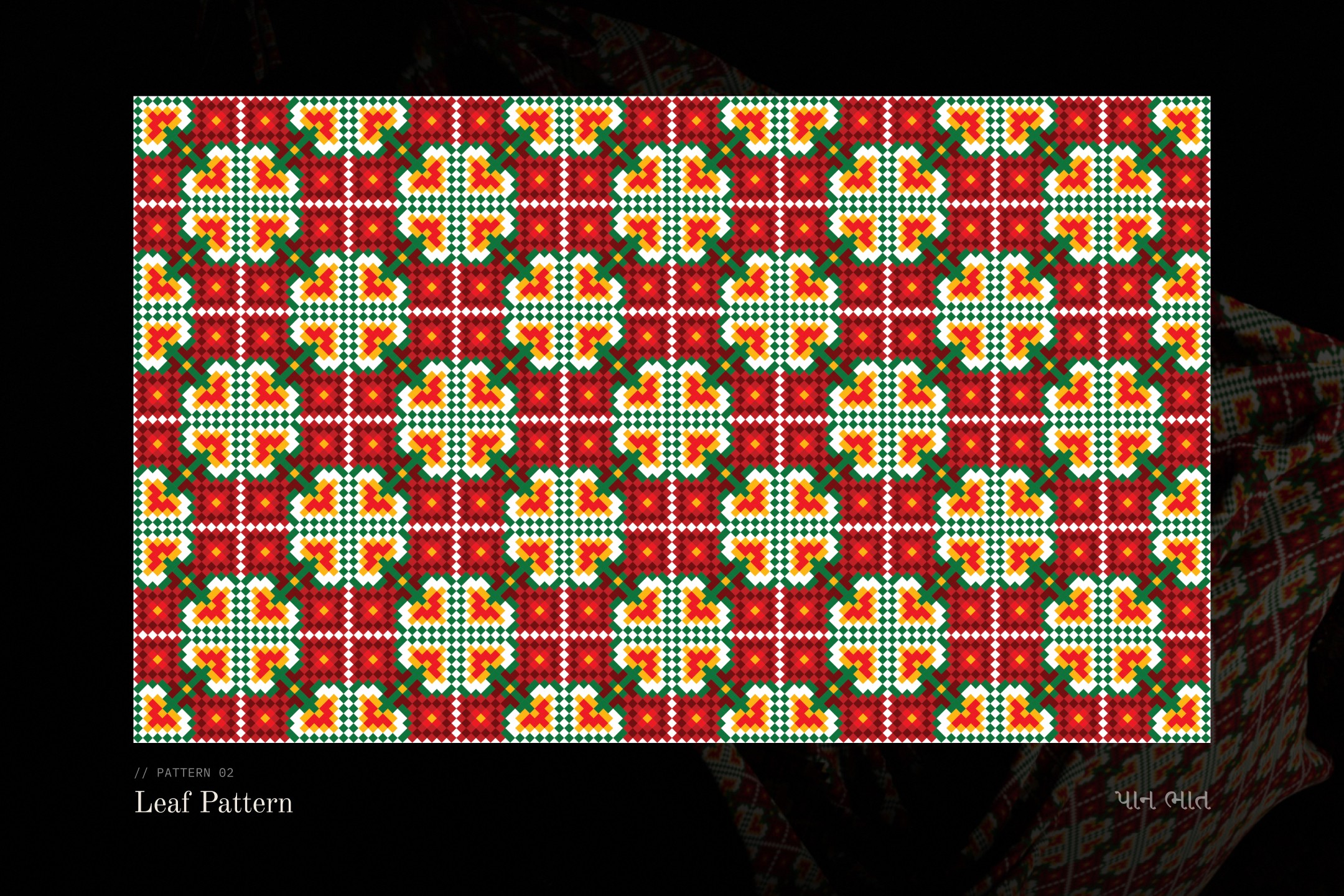
The library holds six patterns, each named after a traditional Patola motif: basket, leaf, geometric floral, chain, flower and nine jewel. I kept their Gujarati names, so each pattern carries its identity, not just its shape.
Every pattern was a balance between detail and simplicity. Flowers, leaves and chains are soft, organic forms, but pixels only allow straight edges. I simplified each motif until it read clearly on the grid, while keeping the rhythm and repetition that make Patola recognizable.



User interface design
A loom, not a canvas
My first interface treated the screen as a loom. Rollers and threads frame a diagonal grid set at the same 45 degree angle as Patola motifs, so visitors feel they are weaving rather than drawing. The layout gives each column one role: the story on the left, the loom at the center, and choices on the right. Nobody starts from a blank grid. Visitors first choose a pattern, then a palette, and the chosen motif stays in view as a reference.
To guide the making, each color carries a number that matches cells on the grid. Tapping a color fills its cells, so the motif builds up color by color. Undo, redo, and clear sit above the loom, so visitors can experiment freely.

Revised concept
A loom with character
The loom worked as a concept, but it felt more like a pixel game than a story, so I went back to the user flow and gave the interface a character of its own.

Testing grid, frame and orientation
Before choosing a visual style, I used six quick layouts to settle four questions. I tested a straight grid against the diagonal one, and returned to the diagonal because it follows the angle of Patola motifs. I tried an illustrated wooden loom around the grid, then removed it so the pattern stays the focus. I compared portrait and landscape layouts, and chose landscape so the loom and the story can sit side by side. Finally, I grouped the controls into cards, which later became a single panel that changes with each step.


Character of the interface
Before building the final interface, I locked three decisions in order. First the character: the loom felt like a pixel game, so I gave it a soft, tactile style inspired by neumorphism, with raised cards on a textured paper background that feel closer to cloth, leaving the Patola patterns as the only bold color.
Then the orientation: landscape, matching the tablet’s position in the installation, so the loom and the story sit side by side. Finally the features: six patterns, a palette drawn from each pattern rather than free choice, undo and redo, the story behind each motif, and a download to take the pattern home.


Refining the interface
Refining the details
With the character set, I refined the details. The shuttle slider moved under the loom so visitors slide to explore pattern information, icon buttons moved from light to dark for better contrast, and I tested four layouts for the story panel to find how much text a visitor will read standing at an installation.


Final interface design
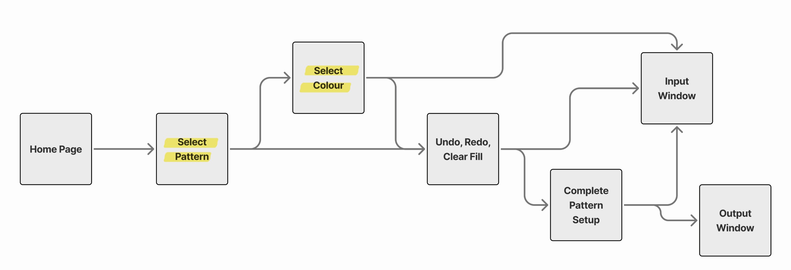
The final interface is built around one idea: the loom never leaves the screen. It stays fixed on the right while the left panel changes with each step of the visit. Visitors first explore all six patterns, each named in English and Gujarati. Once they choose one, its colors appear, and tapping each color fades its cells onto the loom, so the pattern builds up layer by layer as it appears at scale on the cloth. The left panel then tells the motif’s story, and explains what each color and pixel stands for. Visitors leave with the pattern they made.


Identity system design
From stone lattice to pixel
Patan is home to both Patola and Rani ki Vav, a stepwell whose carved stone lattices repeat the same squares and diamonds found in the weave. I began with a mind map of the craft, then studied those lattices, and their grids became my first sketches: small squares building into diamonds, then into marks.

Mark exploration
Choosing the pixel
I drew more than 30 marks in vector. The floral and curving forms were decorative, but they were not immediately recognizable as pixels, so I kept the five pixel diamonds and refined one into the final mark: a diamond built cell by cell, with an open center.

Naming
A name visitors understand
I also explored Gujarati names, such as Ansh Jaali, meaning “unit grid.” Pixel Weave stayed, because visitors understood it at once. I then wrote the name in Gujarati script and tested it in 8 typefaces.

Wordmark
Soft type, rigid pixels
For the wordmark, I tested 13 English and 8 Gujarati typefaces and chose Jedira. Its flowing curves contrast with the rigid pixels of the mark, echoing the soft textile Patola comes from.
Mark system
One mark, every size
The final mark is a diamond built cell by cell, with an open center, paired with Jedira. I tested it from 425px down to 25px so it holds up everywhere, from the loom screen to a bookmark, and drew the palette from Patola silk.





Poster design
Pixels as a teaser
Before the exhibition opened, I designed a poster series to tease it. Each poster plays with the pixel in a different way: motifs repeat in bands, one block is framed and repeated, and a motif is zoomed until its cells become shapes. Visitors met the pixel system before they ever touched the screen.


Pattern extension
Beyond the screen
A Patola is cloth first, so the patterns had to work on fabric too. I placed the blocks on a dupatta, on draped fabric and in a frame to see whether the pixels still read as Patola at full scale, once the cloth folds and moves.


UX installation design
From screen to cloth
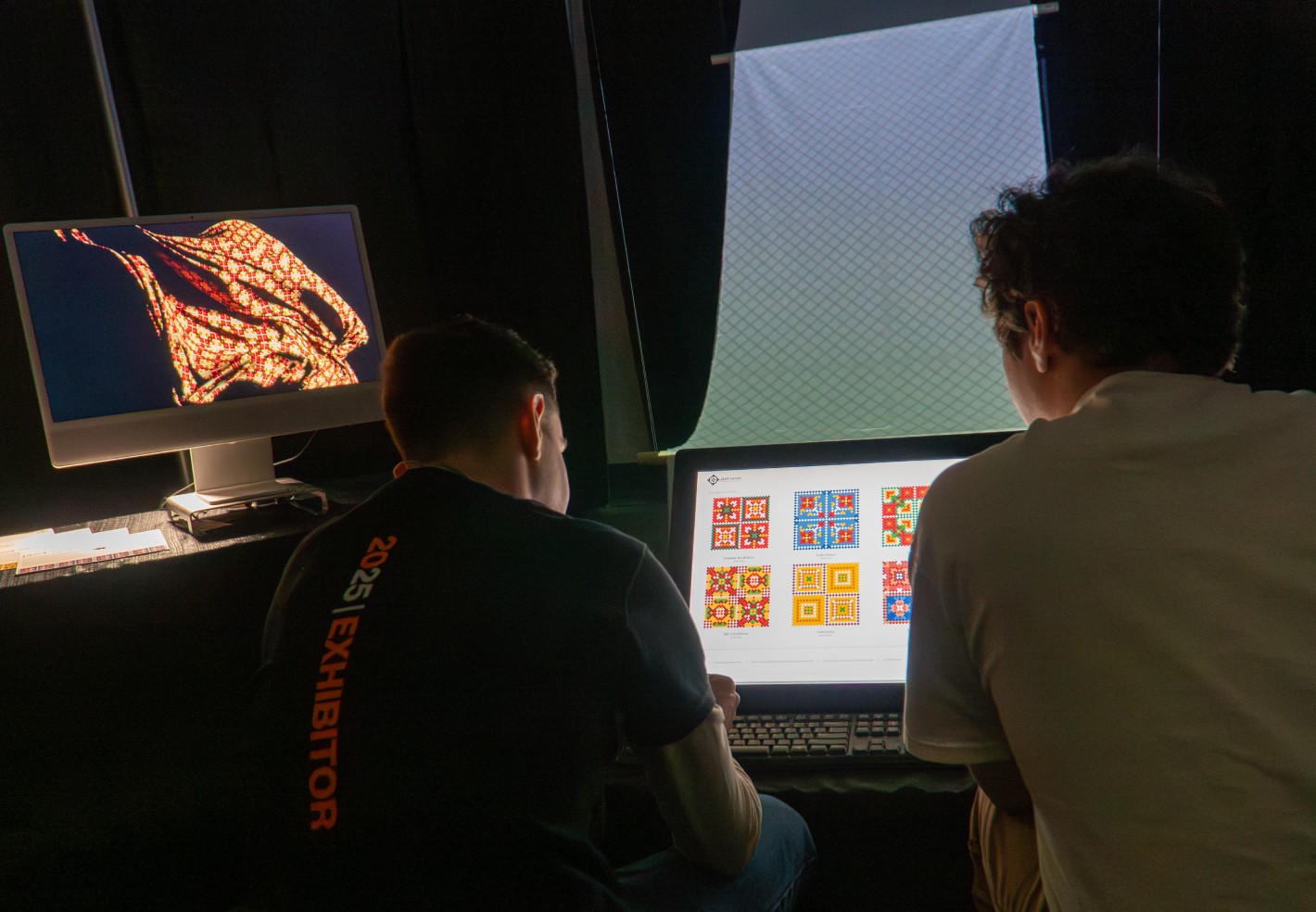
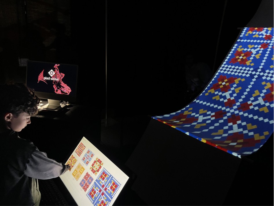
Pixel Weave was shown at Imagine RIT as a museum piece, not an app. Visitors build a pattern on a screen at the front, and it is projected at full scale onto a long cloth behind it, the way fabric comes off a loom. I designed the visit as one short loop that anyone can finish without instructions.
Visitor journey
01 Notice. Walks past and sees the interface at rest: patterns on the left, an empty loom on the right.
02 Choose. Picks a pattern, and its colors reveal beside the loom.
03 Weave and learn. Taps each color, and that part of the pattern fades onto the loom. The meaning of the color and motif sits beside it.
04 Save. Types their email on the keyboard to download the finished pattern.
05 Take away. Leaves with a hand screen printed bookmark.

Installation setup
Built like a loom
I sketched the setup as a loom: a screen where the pattern is built, and a cloth that hangs, curves and falls like fabric coming off the beam. I tested the hang in daylight to set the curve, then in the dark to check the projection.



Takeaway
Pixels back to the hand
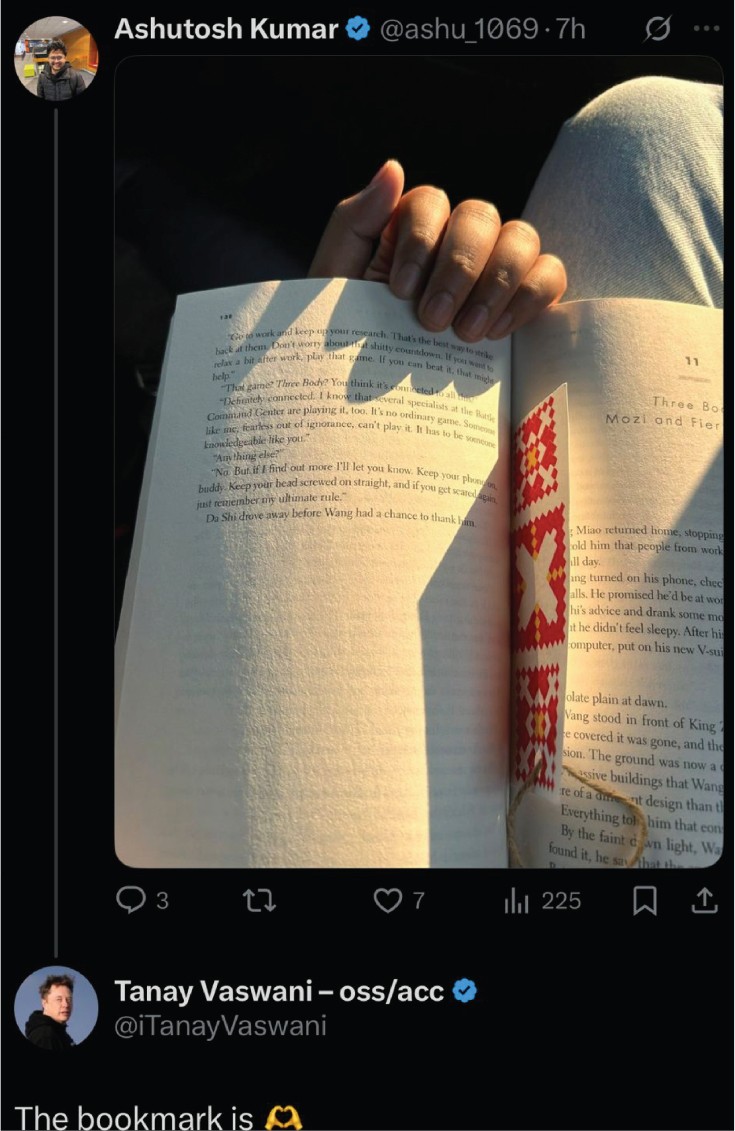
Every visitor could leave with a bookmark. I designed its pattern and hand screen printed it in three colors, one layer at a time, taking the pixel back to the handmade craft it came from.

In the room
Stepping into the pattern
Visitors stepped into the light and let the pattern fall across their faces and hands, wearing the Patola for a moment.


Project recap
What Pixel Weave became
It started with one idea: the grid inside a Patola is already a pixel grid. It ended as a working installation at Imagine RIT that drew more than 350 visitors. They built patterns on a touchscreen, watched them appear on cloth, and took one home as a hand printed bookmark.
What I learned
A constraint can carry a culture. The 21 by 21 grid limited every motif, but it is also what let one pattern move from a screen to cloth, posters and paper without losing its character.
What’s next
I’m now building Pixel Weave into a generative pattern making tool in code. It uses the same 21 by 21 grid and the rules behind each motif to create new Patola inspired patterns. From there, I want to open it to textile traditions beyond Patola.